
So you’re choosing a colour scheme for your wedding: a fun and creative but sometimes frustrating choice that most couples find themselves considering in the weeks and months before the big day.
Maybe you’re the sort of bride or groom who’s had their colour theme chosen since before they had even finished secondary school. Or maybe you’re the type of person who never would have thought that picking a colour scheme – chair colours, table runners and floral arrangements in particular – would now be occupying so much of your daily thoughts. (Common questions may include: What is the difference between “wine” and “burgundy”? Will anyone even notice if we don’t have chair covers anyway?)
Either way, at SOCIAL & PERSONAL WEDDINGS, we strive to take the stress out of these kinds of topics and to introduce you to the tips and tricks that will make it easier. That’s why we’ve put together seven rules to help you choose the perfect colour scheme for your wedding. Read on to discover how to choose the colour scheme that’s right for you.
1/ Choose what you like – not what’s on-trend
For many people who are planning a wedding, spending a lot of time poring over magazines, social media and displays at wedding fairs is standard practice. That can be a lot of fun! Pinning another idea to your Pinterest board or taking lots of pictures of themes you like can help to cement some strong ideas for a colour scheme in your mind.
That said, if what you’re seeing doesn’t match your taste, don’t feel you have to have to go with what’s in fashion at the moment. Trends come and go. Your memory of the day will last longer than the current trend cycle.
To that end, opt for colours that you’re passionate about or that evoke pleasant memories or feelings from you. Draw inspiration from the things that are important to you: Are you eager to add pink roses to your bouquet because they remind you of your grandmother’s garden? Do blues, turquoises or greens remind you of a beach holiday or special trip you took with your fiancé(e)? Are you planning to wear some vintage jewellery with a particular stone that’s been passed down through the generations? Or maybe it’s something simpler than that: Is there a particular colour that you always gravitate to when you’re shopping for clothes?
Choose two or three of your favourite colours and go to rule four to narrow those choices down to the one scheme that’s right for you.
2/ Think about your wedding venue
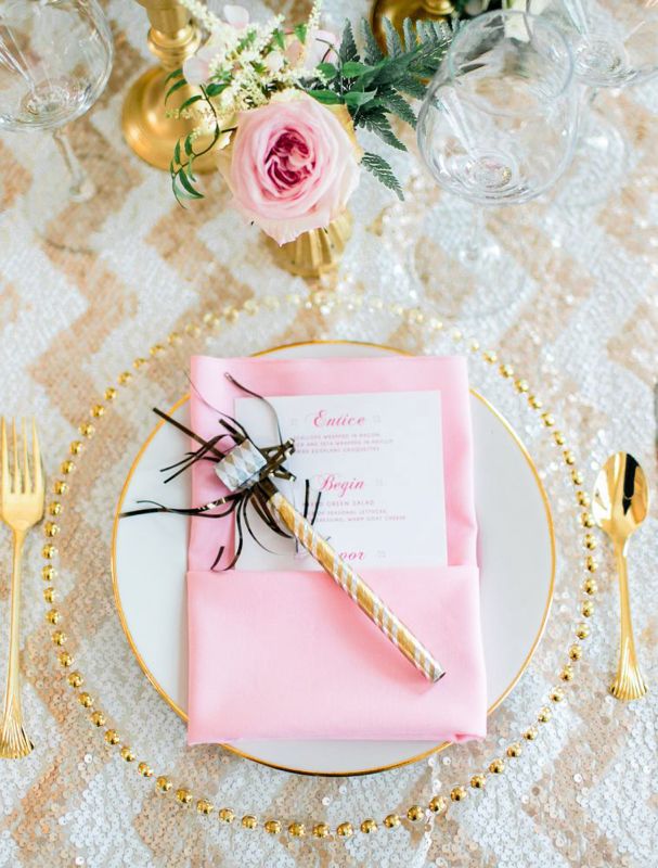
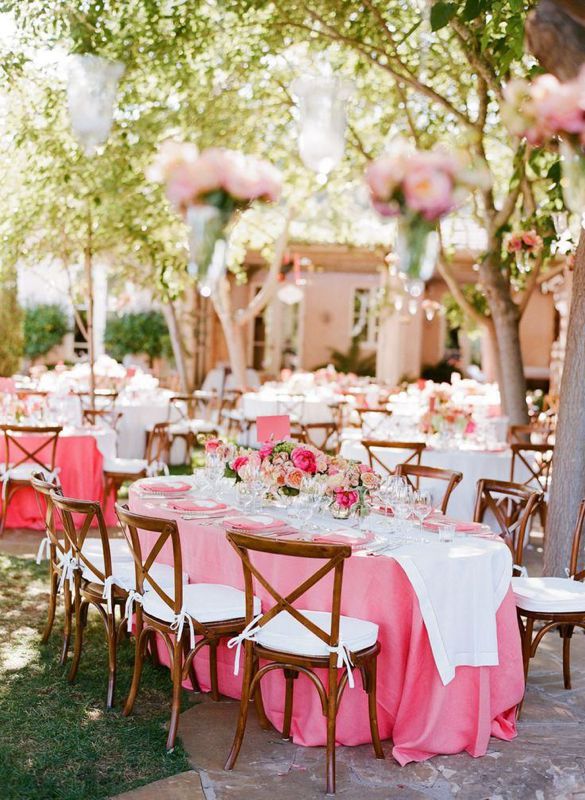
There are no hard and fast rules to colour schemes nor any “right” or “wrong” colours. That said, do keep one eye to your wedding venue when you are deciding on the colour scheme. A hot pink table runner or cloth is probably going to look strange in a historic country manor; similarly, an intricate gold or deep, plush forest green chair cover that may be right at home in a manor might look out of place in a modern function room or laidback venue. Additionally, the venue’s own colour scheme – wallpaper, carpets etc. – might not lend themselves to every scheme. If in doubt, bring a paint swatch of the colours you like (available at any major hardware store) to your chosen venue to see how well they match with the décor. Tip: Hardware shops often have brochures or cards that list attractive complementary colours and colour schemes. Use them for inspiration!
3/ Consider the season – but don’t be tied to it
Certain colour families are associated strongly with seasons – think ice blues, silvers and grey for winter or oranges, reds and browns for autumn. If the colours of the season speak to you, they may be the perfect palette for your wedding’s colour scheme. That said if you want to go with bright greens and florals in winter or a monochrome or grey theme in summer, go for it! Your wedding should reflect you as a couple. If an out-of-season colour palette suits your personal style, that is the right choice for you.
4/ Experiment with colour and complementary shades
Colour can make a great impact on our moods and perceptions – but too much of one colour can become overwhelming. If you have a single favourite colour, your instinct might be to use it in everything – the bouquets, napkins, tablecloths, gift bags etc. However, having a palette of colours rather than one single colour in your scheme is likely to be much more visually appealing and interesting. When you settle on one favoured colour, experiment to find colours that complement it. Website Colormind (http://colormind.io/) has a fun and free generator that will let you cycle through palettes of complementary colours. Choosing two or three colours (or more, if you like!) that complement each other will elevate your colour scheme.
5/ Watch out for clashes
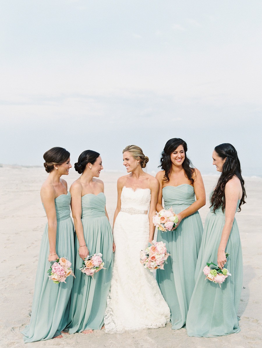
Now that you have a chosen colour scheme, watch out for anything that might clash with it. That includes bouquets, wedding, bridesmaid and flower girl dresses, suits or boutonnieres. If you’re going for green in your table settings, for example, having a bridesmaid dressed in orange or red may not be a great match. (That’s not a hard-and-fast rule, however; those with a good eye for colour may be able to make traditionally clashing colours work.) Think of your colour scheme holistically and not as something that applies only to the venue.
6/ Speak to your planner – and be specific
If you’re working with a wedding planner (through the venue or an independent planner), make sure the planner knows exactly what you want in your colour scheme. That means that you need to be specific with the colours, right down to the shade. If you tell your planner you want yellow as your colour scheme, does that mean that you want a lemon, mustard or canary yellow? Leave no room for misinterpretation – show the planner exactly what colours you have in mind. (If you’ve been collecting paint or fabric swatches, share those with the planner.
This advice applies even if your family or friends will be the ones collecting, buying or choosing items for the venue. There are infinite hues and shades in the world. Don’t assume everyone perceives colour in the same way as you.
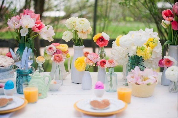 The colour scheme for Easter is bright, vibrant pinks, sunny yellows and pastel blues.
7/ Don’t sweat the small stuff
When it comes to wedding planning, the smallest seeming decisions can occupy more of your mental space than you ever thought possible. With that in mind, give yourself a break and roll with the punches. Your wedding won’t be ruined if you can’t locate napkins in the exact shade of coral that you’ve set your heart on; if a burnt orange, peach or dusty rose option is available and still fits the scheme, embrace that. If you need to nix one colour from your scheme because you just can’t find a suitable option, it’s not the end of the world. Be open to new possibilities and options and you might be surprised at just how much better you like them.
-- Erica Mills