
The start of December means Christmas shopping, Spotify Wrapped, and, most excitingly (in my opinion, anyway), the Pantone Colour Institute carrying on its grand tradition of naming its colour of the year. The highly anticipated Colour of the Year for 2026 has been chosen, and I think I can speak for every wedding journalist when I say we're delighted to ring in the new year with Cloud Dancer (PANTONE 11-4201)!
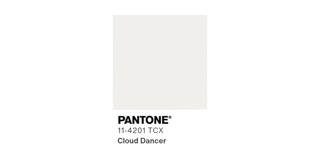
The first time their top pick has fallen within the soft white spectrum, Cloud Dancer has a gentle warmth. Think of soft clouds drifting overhead or freshly washed linen catching in the breeze. While 2025’s choice, Mocha Mousse, wrapped itself in comfort and calm, Cloud Dancer invites a shift towards simplicity, serenity and a cleaner kind of refinement.
Why Cloud Dancer Works So Well for Weddings
Now you might be saying, "Gráinne, what's the big fuss about white? It's not a particularly rare colour in the wedding world.", and I can tell you that Cloud Dancer is the kind of white that feels gentle and relaxed rather than formal or fussy, which is a lot harder to find than you would think. There is warmth in it, which means it creates a sense of ease and welcome, and that naturally nudges a wedding atmosphere toward softness and connection. Couples who prefer subtle elegance over anything loud or lavish will find that Cloud Dancer fits beautifully into their vision.
 Tess Shannon Photography
Because the tone sits in a neutral space, it gives you the freedom to build your palette in a way that feels truly personal. If you love a dreamy, romantic style, pair it with pastel florals and soft textures. If you gravitate toward something richer and more dramatic, it balances deeper tones such as olive, plum or antique gold without being drowned out. Whether your day is taking shape as a cosy barn ceremony or a chic city celebration, Cloud Dancer settles into the environment with ease.
 Jade Osborne
How to Use Cloud Dancer in Your Wedding
So how do I incorporate the shade into my day? Good question! Here are some practical ways to introduce Cloud Dancer into your styling, from outfits to décor.
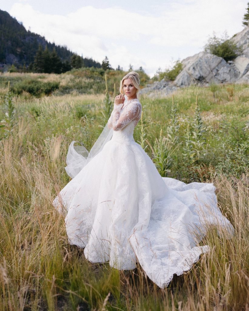
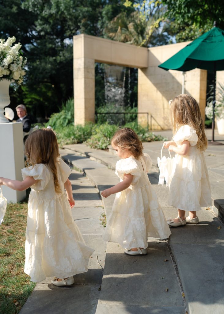
Bridal and Wedding Party Looks
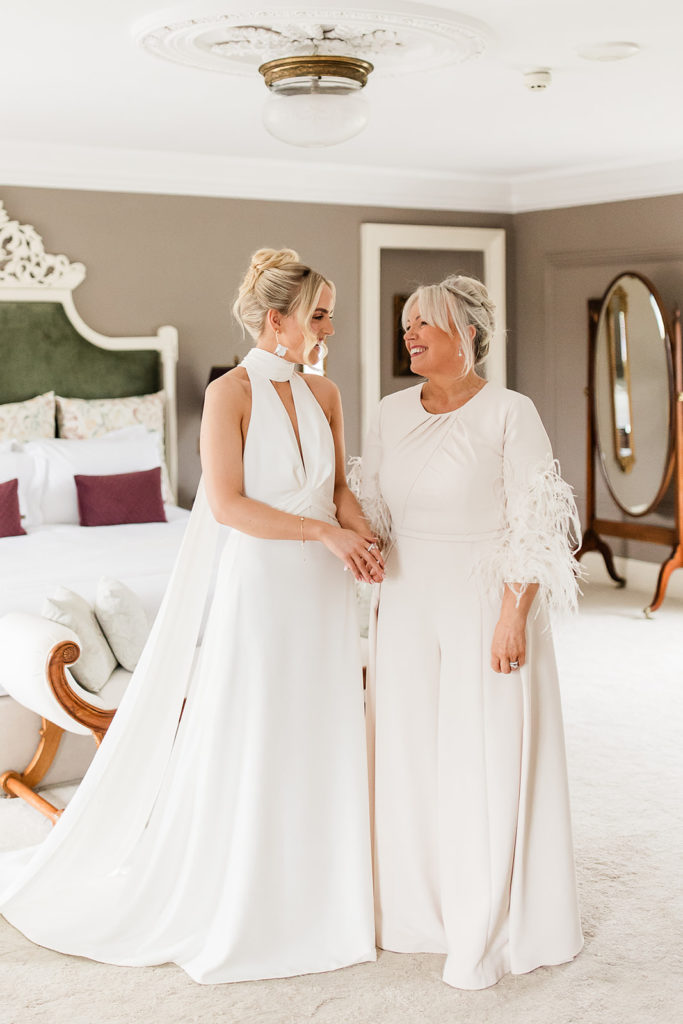
Flowing chiffon gowns, layered tulle, natural silks, and light linen all suit this softer white beautifully, mainly because they allow the fabric itself to shine. Movement, texture and cut become the focus, which is ideal if you are drawn to simple silhouettes or unfussy tailoring. For brides who want something timeless but not overly formal, this tone feels wearable and natural rather than stiff.
 Camera Shi
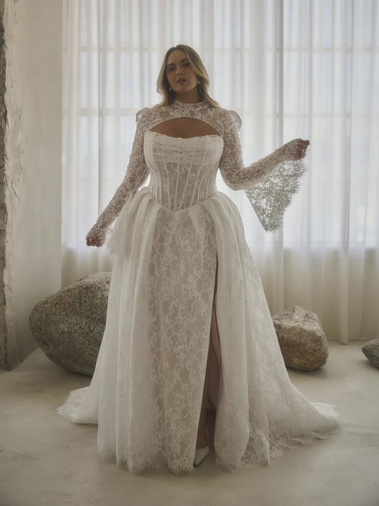
 Laura Parkinson Photography
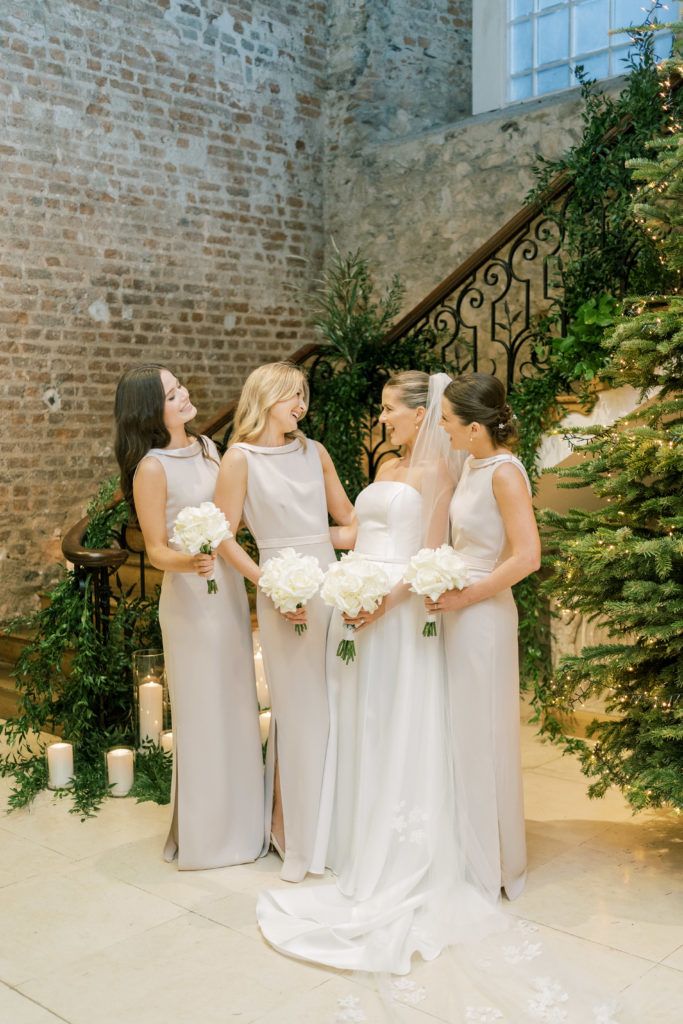
For bridesmaids, this shade works particularly well when dresses are mixed and matched, whether that means different silhouettes, fabrics, or subtle tonal variations. Linen, satin or chiffon all sit comfortably together, creating a look that feels intentional but relaxed. It suits bridal parties who want to look polished while still feeling like themselves, and it gives plenty of room to introduce colour through bouquets, jewellery or shoes if you wish.
 Studio Brown
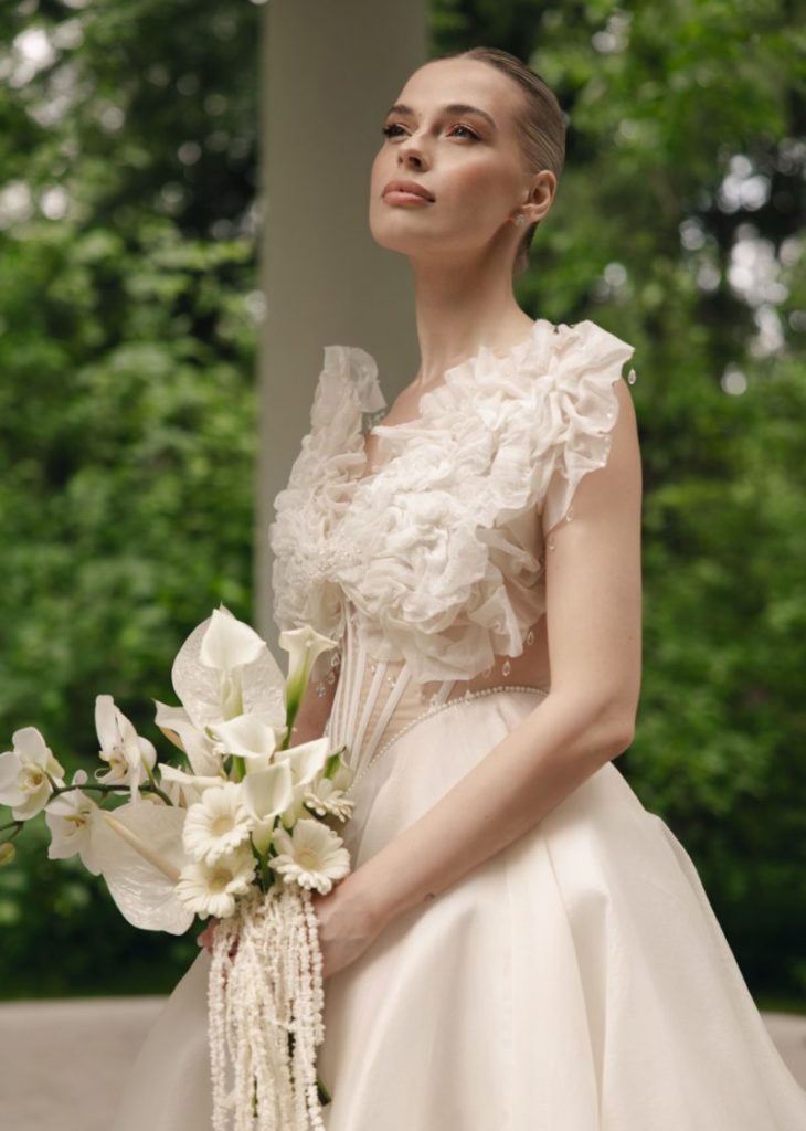 Ulyana Popova
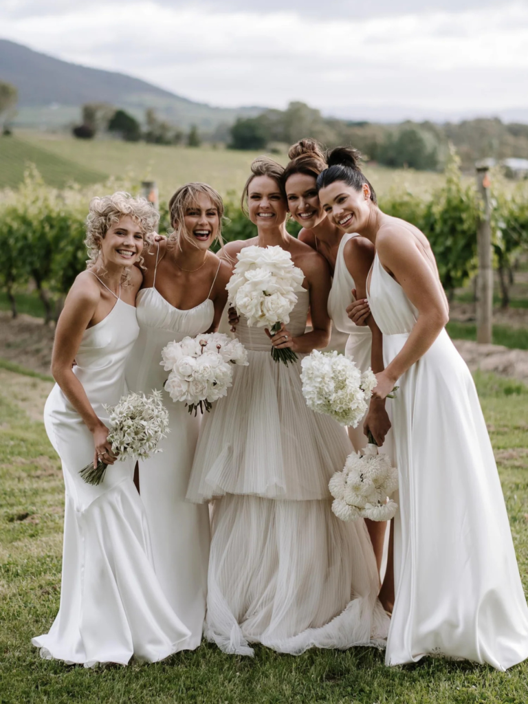 Tess Follett
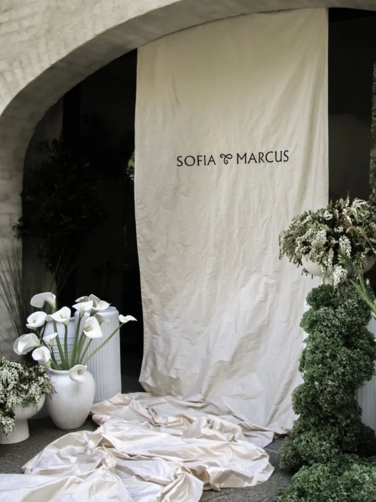
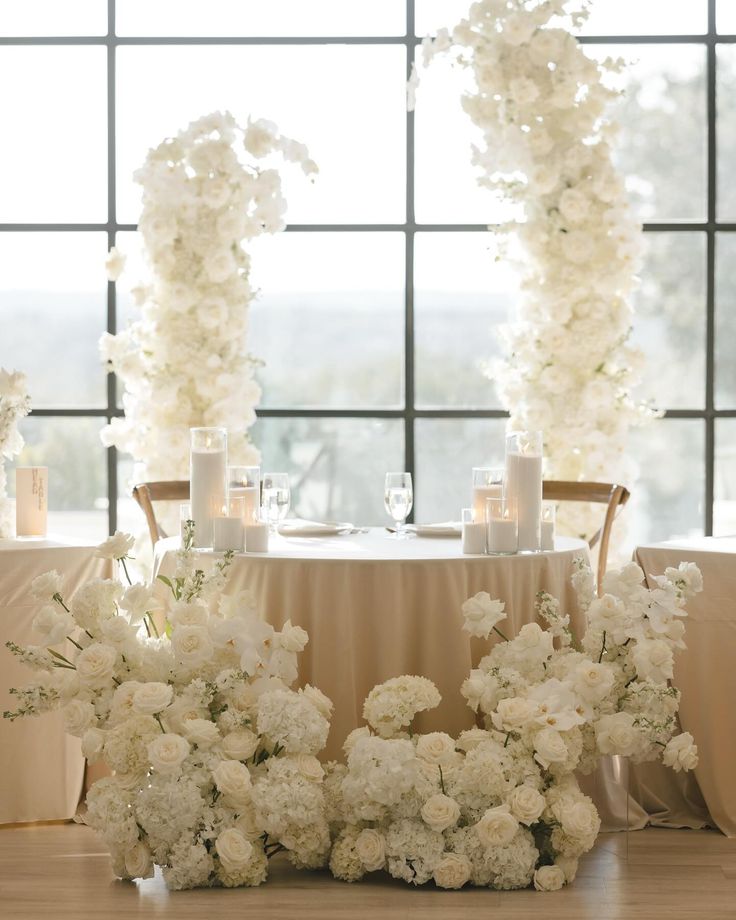
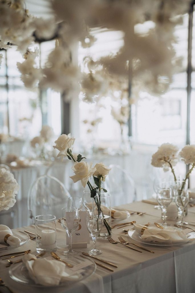
Venue Décor and Textiles
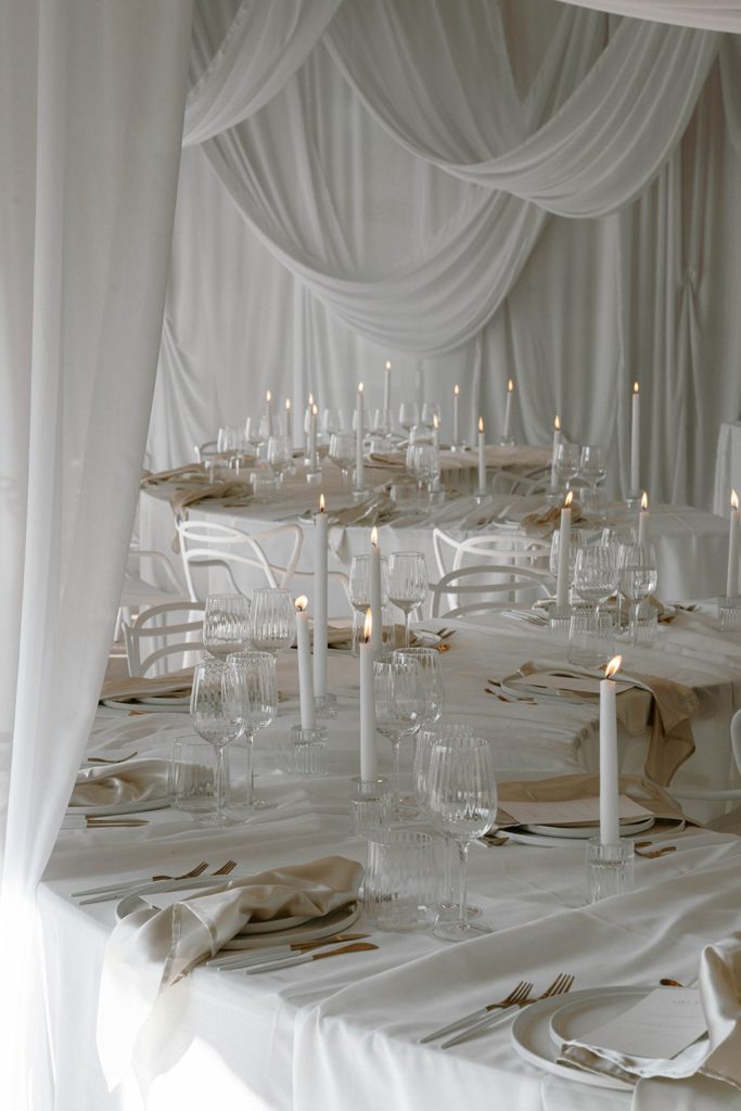
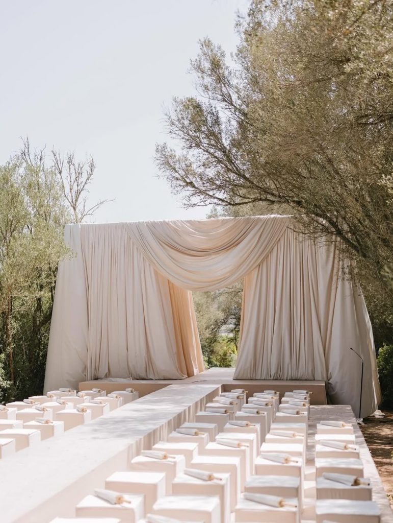
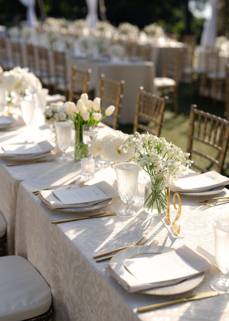
Table linens, soft runners, draped arches, chair covers or ceiling fabrics in Cloud White look natural and unforced, never competing with the space around them. It is especially helpful in venues with strong architectural features, such as timber beams, stone walls, or patterned floors, as it softens the overall look rather than fighting them.
 Anna-Lena Holz
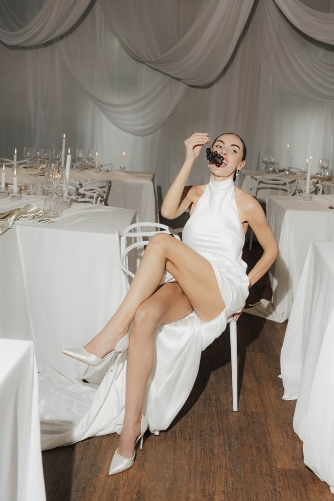 Anna-Lena Holz
Because it is such an easy colour to work with, it pairs beautifully with greenery, candlelight and warm metals. You can layer it generously without the space feeling flat or washed out. If your goal is a setting that feels calm, considered and welcoming, this shade helps everything sit quietly together while still feeling thoughtfully styled.
 Pablo Béglez Photography
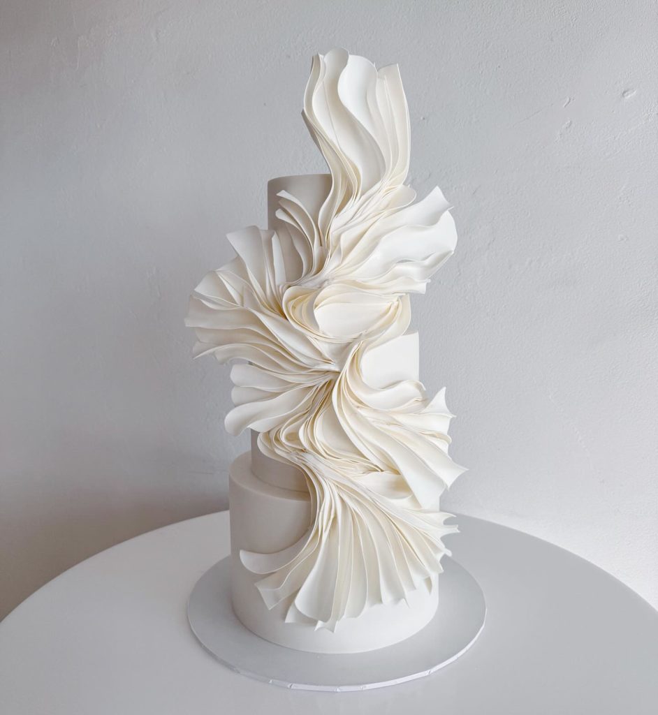 Lions Den Cakes
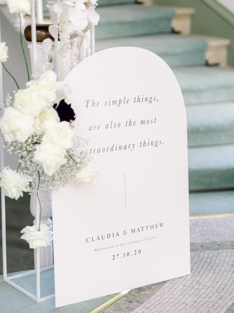
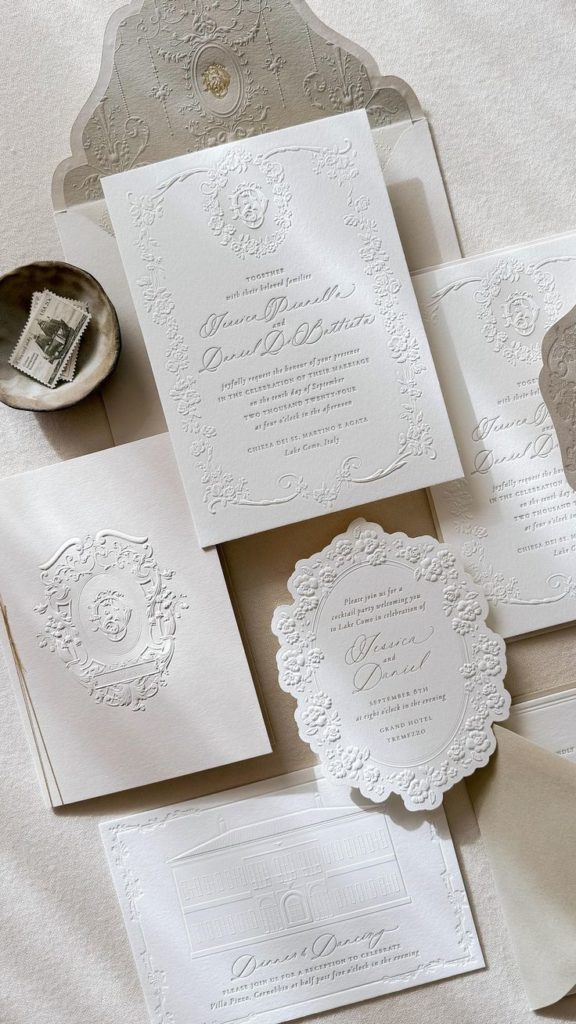
Printed Elements and Stationery
This palette really comes into its own when used for stationery and paper goods. Invitations, menus, place cards and signage all benefit from a soft white base that feels clean but not stark. It gives designs breathing space, which is especially useful if you are including meaningful wording, layered typography or personal details.
 Plume Calligraphy
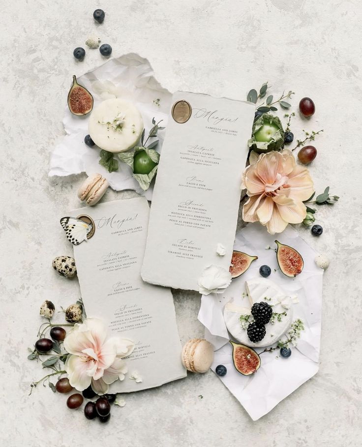
Because the background is so gentle, finishes like calligraphy, embossing, blind lettering, or coloured inks stand out clearly without feeling harsh. Even simple layouts feel elevated. If you want your stationery to feel cohesive from the first save-the-date to the final place card, this approach offers consistency while still allowing your personality to come through.
 Esthetic Bride
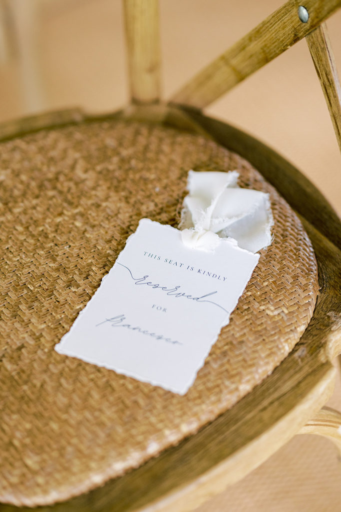 Studio Brown
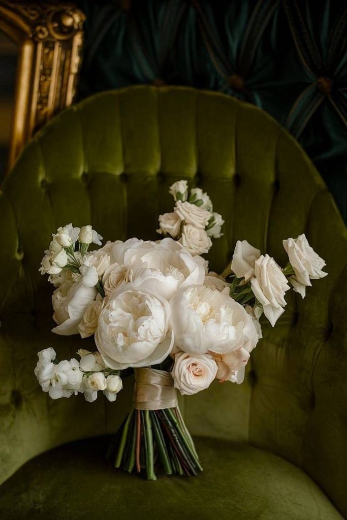
Floral and Greenery Pairings
If you lean toward soft and romantic, white roses, anemones, sweet peas, or ranunculus will look beautiful at home next to Cloud Dancer. These blooms blend in naturally, creating an overall look that feels calm and balanced rather than overly styled. Mixed greenery adds shape and movement, keeping arrangements feeling fresh and relaxed.
 Hausmann Wedding
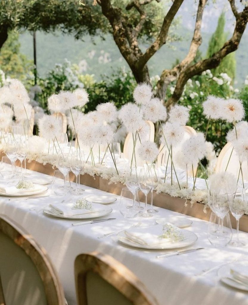
If you are drawn to stronger colours, this softer white still holds its own. Shades like dusty rose, mauve, burgundy, or deep green create a beautiful contrast when used thoughtfully. The light base keeps those richer tones grounded, so the overall palette feels elegant and well-balanced rather than heavy.
 Hannah Bri Photography
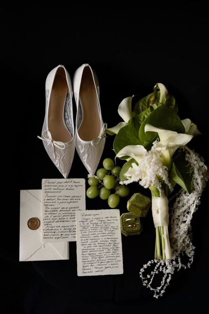
 Stephanie Kunde
- Gráinne