
If there’s one thing 2026 is doing really well, it’s colour with feeling! From layered pinks that feel romantic but not predictable, to bold citrus shades that bring a fresh, fashion-led energy, wedding colour this year is all about expression rather than rules. Couples are moving away from palettes that simply look nice and leaning towards combinations that actually say something. Whether that’s softness, joy, drama or a bit of edge, these are the colour stories shaping 2026 weddings.
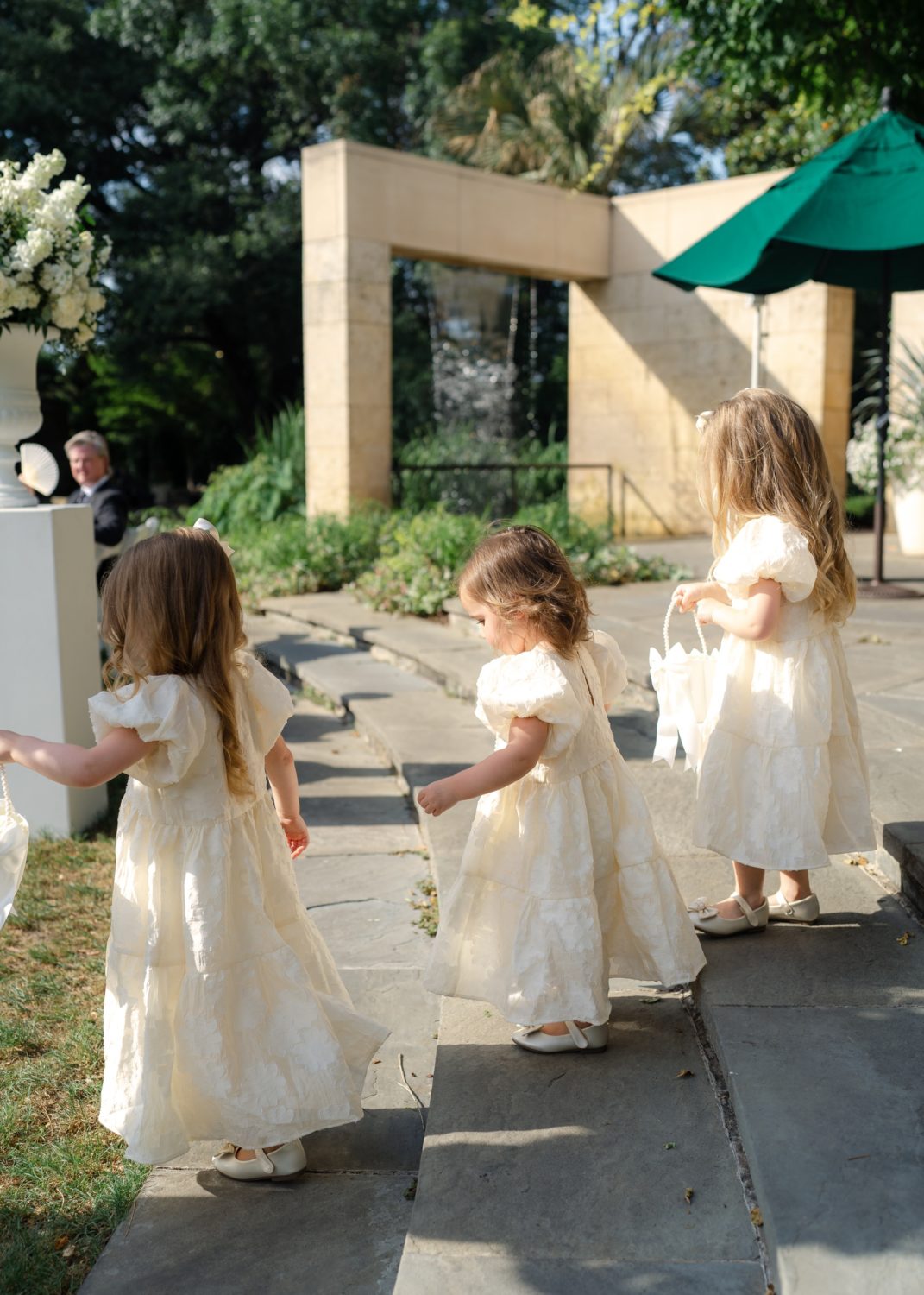
Blush and Bloom
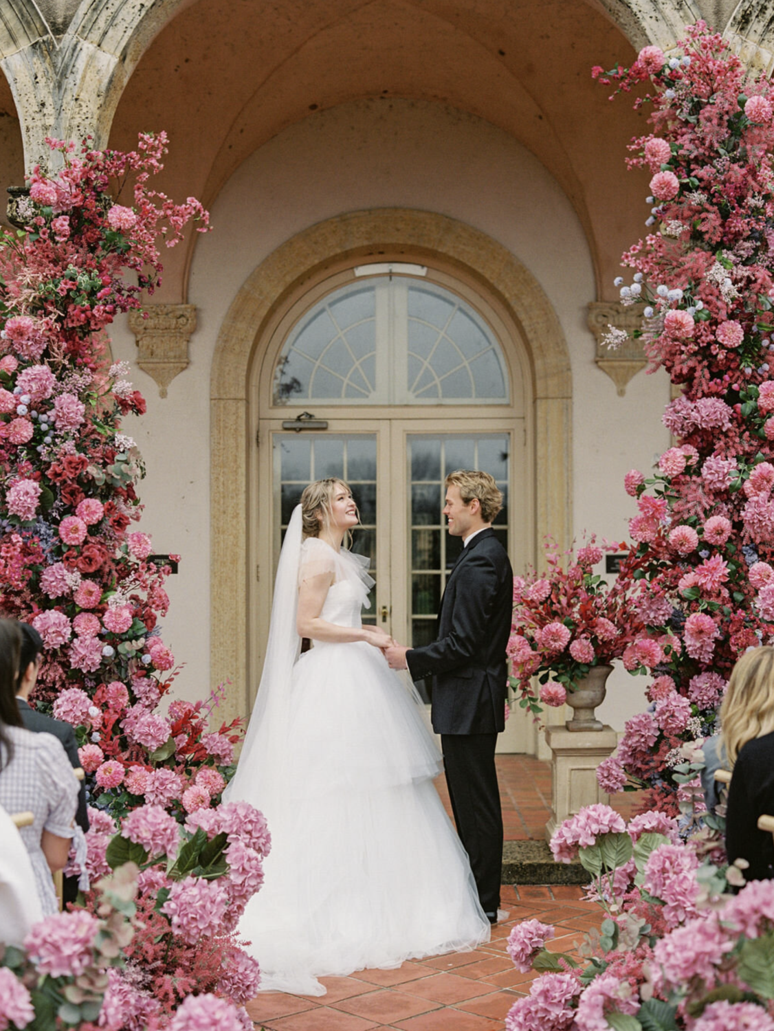
Pink is having a very grown-up moment. A far cry from the Barbie-pink epidemic of 2023, richer, duskier, and altogether more elegant shades have made their presence felt across the spring/summer 2026 runways. Instead of a one-note blush, this palette plays with layers, mixing soft petal pinks with deeper rose tones and finishing it all off with fresh greenery. The result feels romantic but relaxed, pretty without tipping into overly sweet.
 Max Owens Design
What makes blush and bloom work so well is the balance. The greenery keeps everything grounded, while the mix of pink tones adds depth and interest. It feels thoughtful rather than themed, which is why it suits so many different styles of weddings. In spring and summer, it feels light and floral, especially with garden-style arrangements, flowing fabrics and natural light. In autumn, leaning into dusky rose, mauve, and even berry-toned pinks adds a little more richness while still keeping that romantic feel.
It’s also a palette that photographs incredibly well. Pink flatters almost everyone, greenery adds balance, and together they create a look that feels timeless rather than trend-led. If you want something that feels safe but still interesting, this is a very solid place to land.
Antique Lace
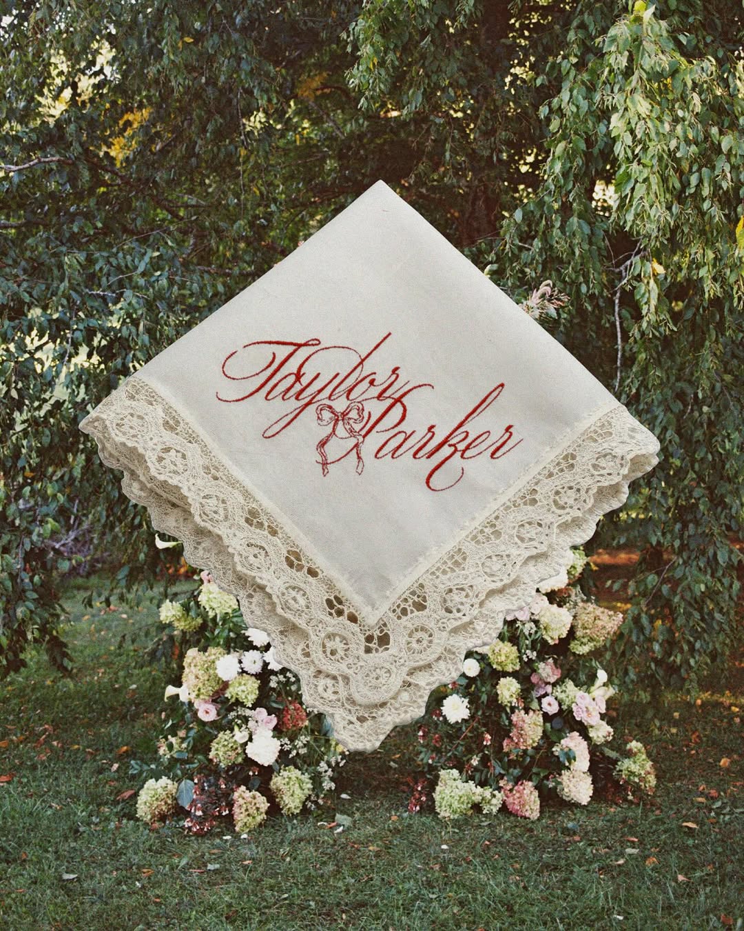
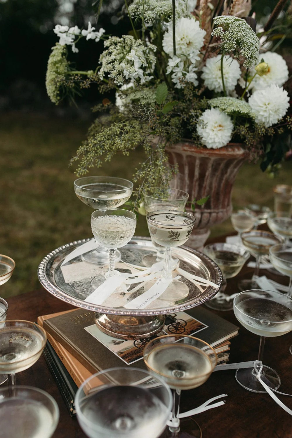
If you love neutrals but want something with a bit more soul than crisp white, Antique Lace is for you. With Pantone's choice for 2026 being a creamy white, this feels like a no-brainer and a return to the classics. Think creamy ivories, soft champagnes and gentle off-whites that glow rather than glare.
 Taylor Parker Photography
It’s an especially beautiful option for couples drawn to a classic, romantic feel but who still want their wedding to feel current. These tones work so well when layered through texture. Linen tablecloths, lace details, matte ceramics and lots of candlelight all help bring the palette to life.
 Camera Shi
Antique Lace really comes to life through texture. Linen tablecloths, lace details, handmade stationery, matte ceramics and plenty of candlelight all add layers without adding colour. It’s understated, but never boring, the kind of wedding that feels just as beautiful in the moment as it does looking back years later.
 Alixann Loosle Photography
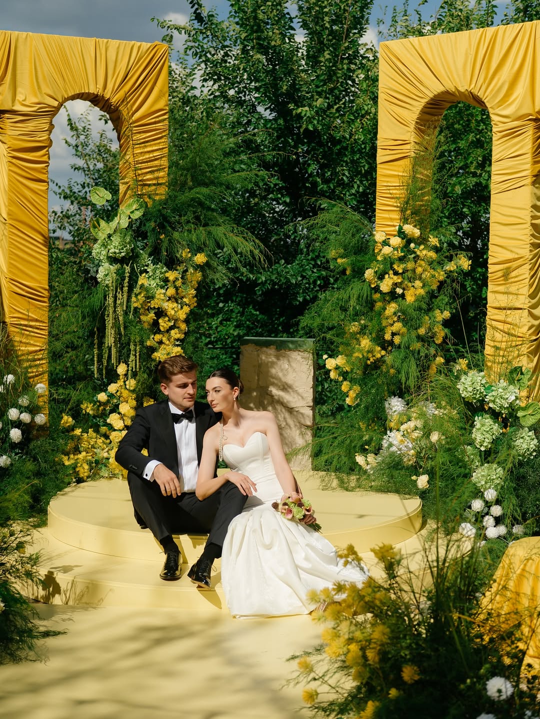
Sunburst Yellow
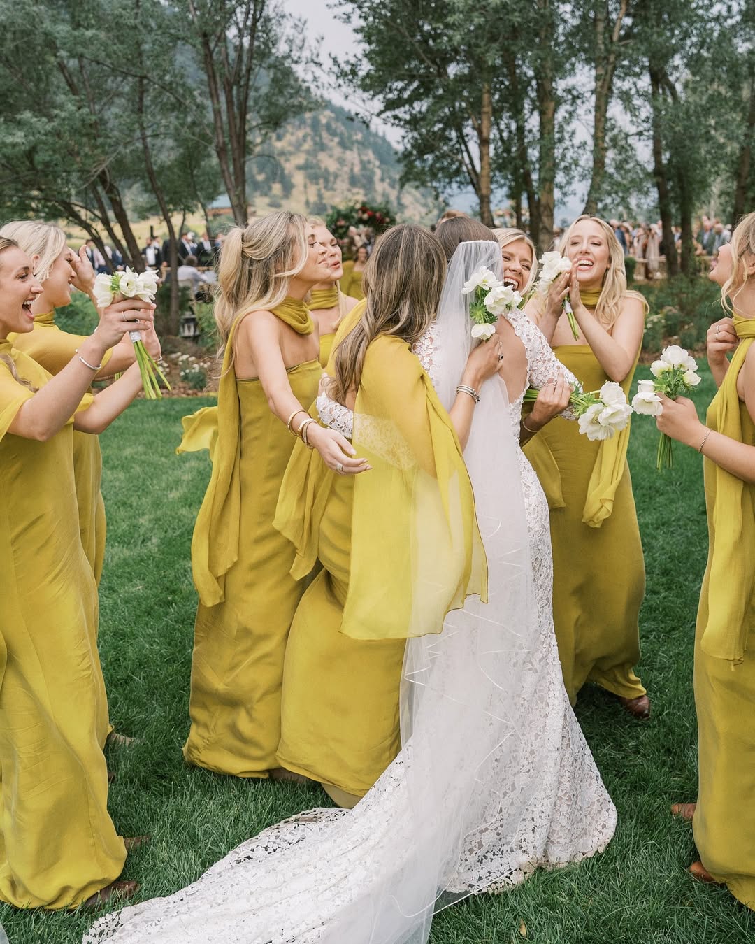
Yellow is back, and it’s feeling joyful rather than gimmicky. If 2025 belonged to Butter Yellow, 2026 is embracing bolder, sunlit tones that feel optimistic and energetic. It’s the kind of colour that makes people smile the moment they walk in.
 Lago Event Park
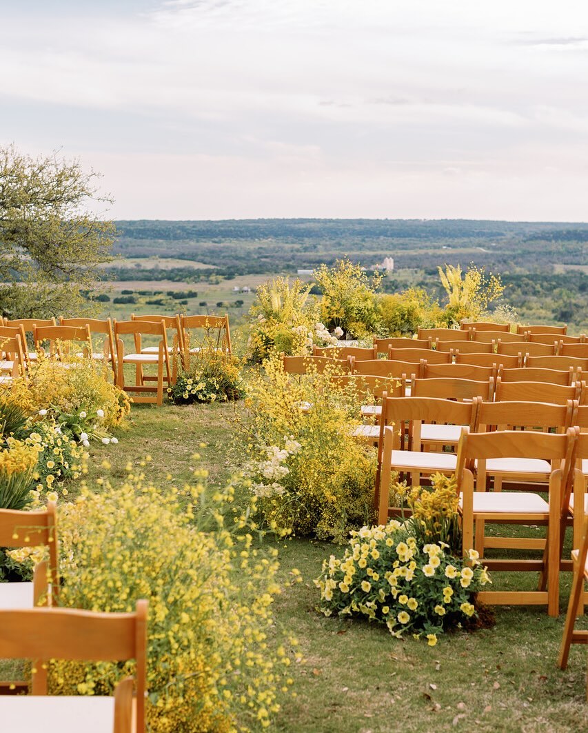
For a long time, couples have been a bit cautious around yellow, but when it’s done well, it can be incredibly chic. Paired with soft neutrals, warm whites or muted greens, it adds personality without overpowering everything else. This palette is especially gorgeous for outdoor weddings, summer celebrations or venues flooded with natural light. It works beautifully with seasonal florals, relaxed tablescapes and a more laid-back atmosphere.
 Max Owens Designs
You don’t have to go all in either. Yellow works just as well in smaller moments. Florals, stationery, napkins, candles or even a hint of citrus on the tables can completely change the mood. It brings optimism and energy, which feels very fitting for weddings right now.
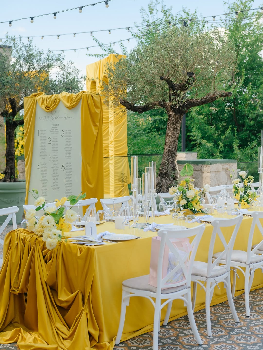 Lago Event Park
Crimson Canopy
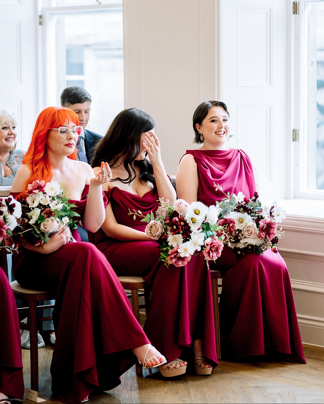
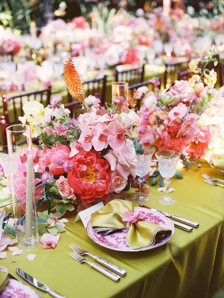
For couples who love a bit of drama, Crimson Canopy delivers in the best way. Deep reds, wine tones and burgundies paired with olive green feel rich, romantic and slightly moody, without ever feeling heavy. This palette really comes into its own in candlelit spaces, historic venues or evening receptions. Think long tables, low lighting, textured florals and fabrics that feel lush and tactile. There’s a sense of intimacy to it that feels very intentional.
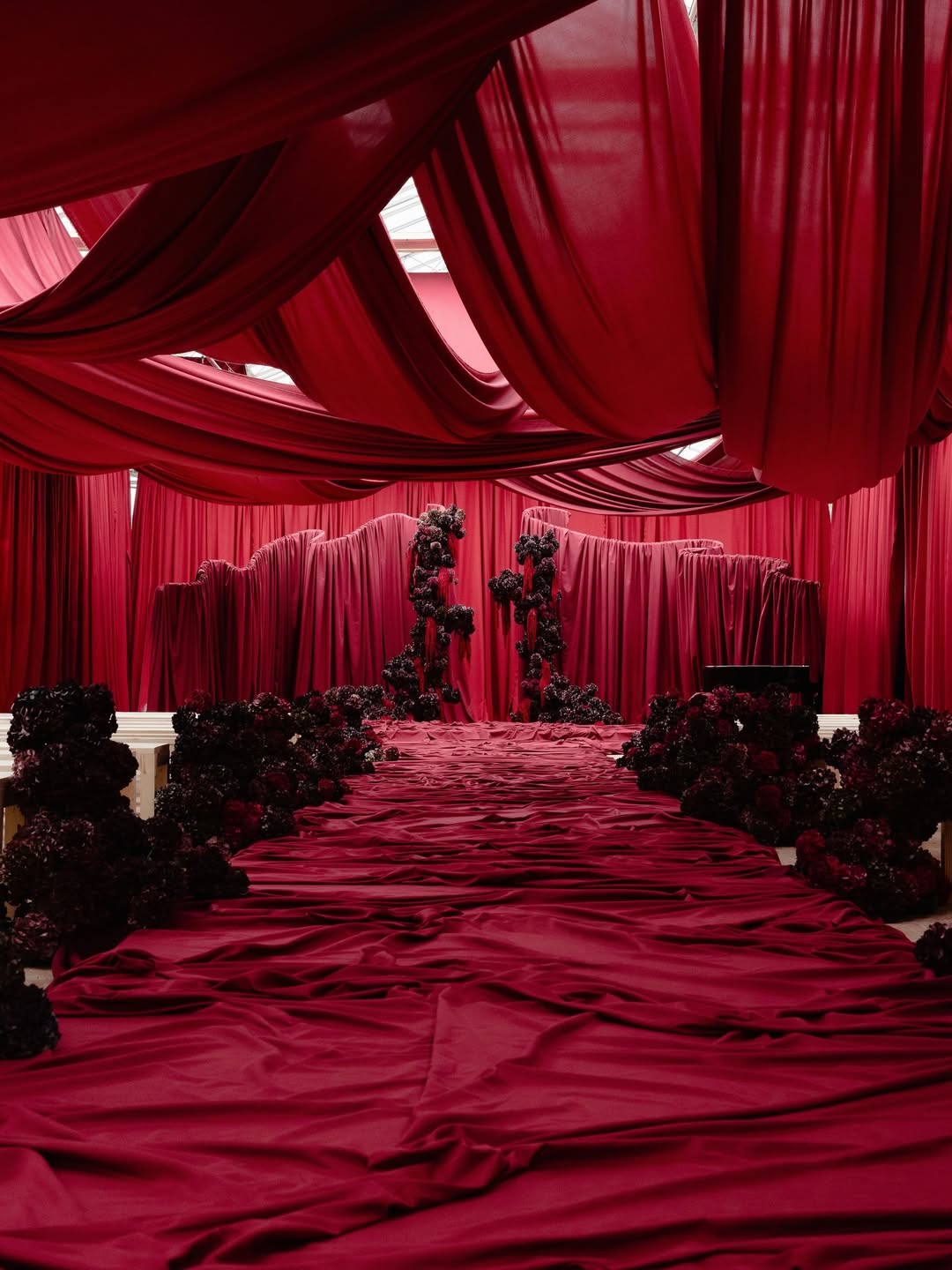 Erik Winter
Olive green plays a big role here. It softens the deeper reds and keeps everything grounded, stopping the palette from feeling too formal or overpowering. It also ties in beautifully with natural surroundings and foliage-heavy styling.
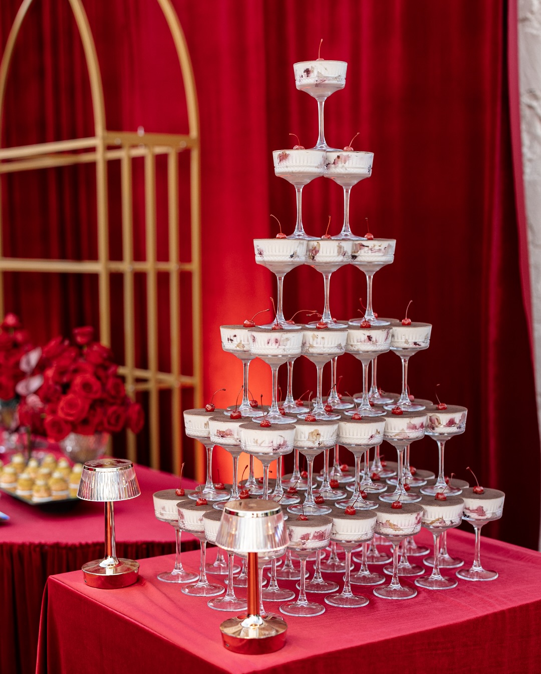 Lago Event Park
It’s a brilliant choice for autumn and winter weddings, but it can work year-round with the right balance. There’s something incredibly confident about this colour story. It feels considered, atmospheric and full of depth.
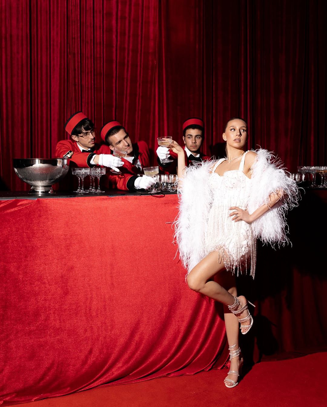 Lago Event Park
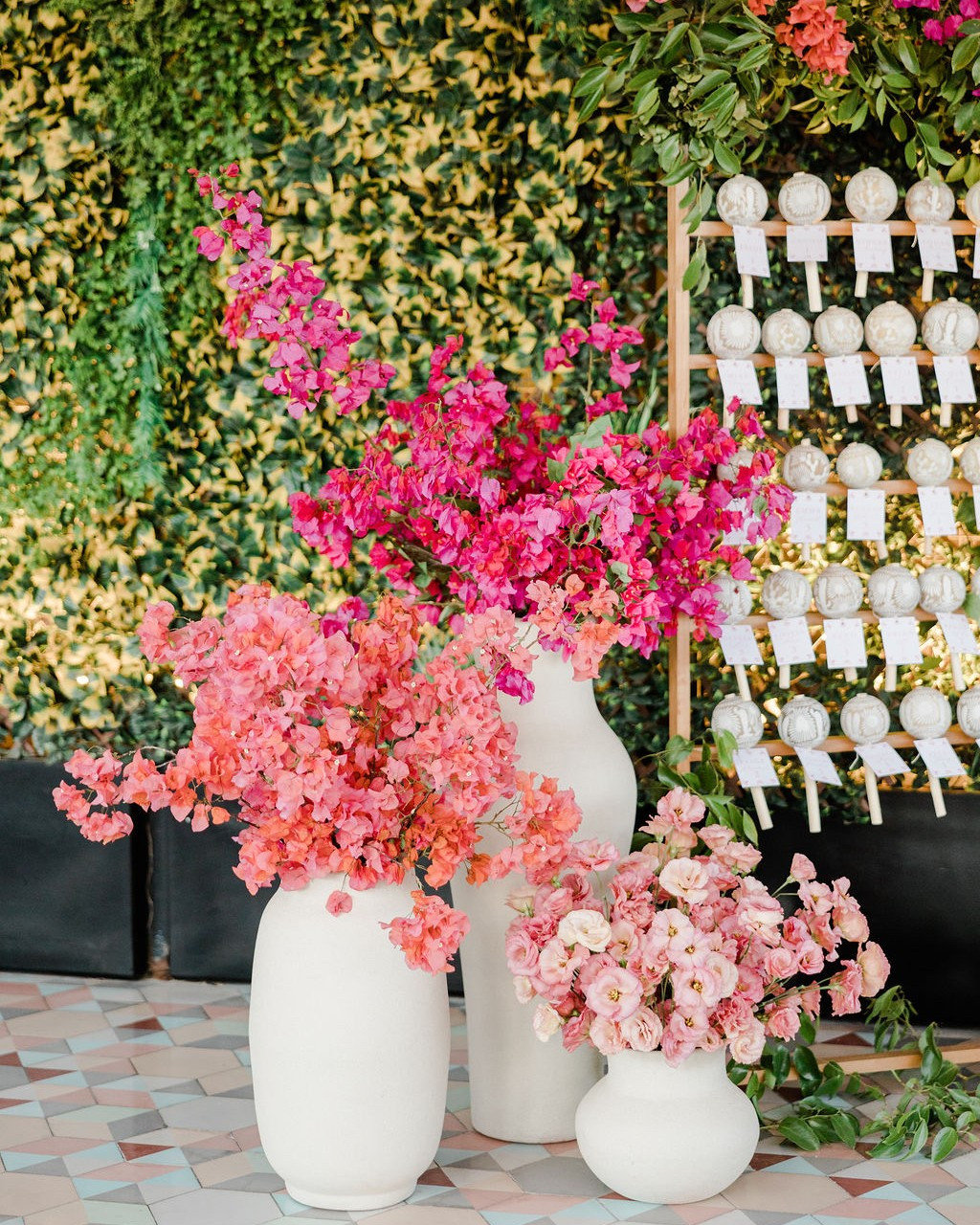
Electric Citrus
If your style leans more modern than traditional, Electric Citrus is definitely worth a look. Lime green paired with flashes of yellow feels playful, fresh and very now. It’s bold, but when used thoughtfully, it feels exciting rather than overwhelming.
 Elizabeth Lanier Photography
This works particularly well in clean, contemporary spaces where the colour can really shine. Crisp whites, soft greys or simple neutrals give these brighter tones room to breathe. You might use it in signage, stationery, table details or even your florals for a punchy moment.
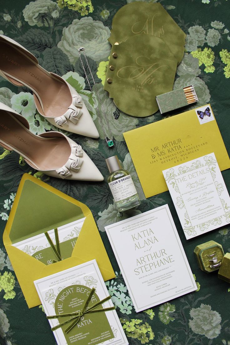
It’s a great option for couples who want their wedding to feel fun and expressive, with a nod to fashion and design rather than tradition.
 Jillian Mitchell Photography
- Gráinne